
Healthcare data often lives in many places at once. Electronic records, billing tools, telehealth systems, patient monitoring devices. Each one holds part of the picture.
Individually, they make sense. Together, they can feel fragmented.
Structured dashboards bring these pieces into one view. Instead of switching systems, users see connected information inside the same interface. A saas healthcare software data reporting tool helps organize that flow so patterns become visible instead of hidden inside separate modules.
And when information connects, decisions become less reactive.
Measuring performance across facilities and teams
Large healthcare organizations operate across multiple locations. Comparing performance between facilities requires standardized metrics.
Structured dashboards allow leaders to evaluate:
- Appointment volume trends
- Readmission rates
- Resource utilization
- Patient satisfaction indicators
Comparisons highlight strengths and gaps.
Still, interpretation requires context. A rural clinic and a metropolitan hospital may serve very different populations. Raw numbers alone cannot tell the whole story.
Visualization systems help by presenting consistent metrics while leaving room for explanation.
Monitoring engagement and adherence patterns
Patient engagement influences outcomes in many settings. Monitoring adherence to treatment plans or follow up visits helps teams identify potential risk areas.
Dashboards can track:
- Missed appointments
- Medication compliance trends
- Telehealth participation rates
Patterns appear gradually. Sometimes subtle.
And sometimes the trend is not dramatic but steady. That quiet change can be more important than sudden spikes.
Structured reporting makes those gradual shifts visible. Without visualization, they might remain buried in data tables.
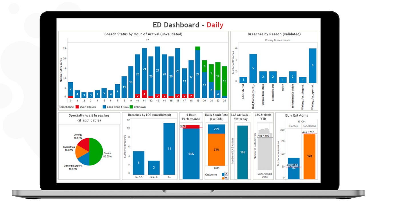
Operational reporting for hospital management
Clinical decisions rely on more than patient metrics. Operational efficiency shapes care quality too.
Hospital management dashboards often monitor:
- Bed occupancy
- Staff allocation
- Equipment usage
- Discharge timelines
When these operational indicators align with clinical metrics, leaders gain a broader understanding of system performance.
A well implemented saas healthcare software data reporting tool supports both perspectives within the same environment. Clinical and operational data do not compete. They complement each other.
Sometimes even small operational adjustments improve patient flow significantly.
Balancing simplicity with depth in analytics
Too much information overwhelms users. Too little leaves gaps.
Effective visualization systems find balance. They prioritize clarity while allowing deeper analysis when necessary.
Some organizations prefer minimal dashboards with only essential indicators. Others request comprehensive views with advanced filtering.
There is no universal preference.
What matters is flexibility. Reporting systems should adapt to workflow rather than forcing workflow to adapt to the tool.
Structured data visualization inside healthcare platforms does not replace professional judgment. It supports it. When insight is organized, accessible, and role specific, clinical decisions feel less uncertain. And in healthcare, reducing uncertainty often improves outcomes quietly, one decision at a time.