The difference between a show-stopping banner and a disappointing printout often lies in the details most people overlook. If you’re rushing to prepare artwork for a trade show or event, even a small oversight can turn your vibrant graphics into a headache. Here’s what every designer and marketer should know before sending their banners off to print.
What Are the Most Common Mistakes When Preparing Banners for Print?
A surprising number of banner designs hit the printer with costly mistakes baked in. Overlooking the bleed and trim areas is a top culprit, closely followed by ignoring the safe zone for text and logos. Then there’s the technical side: using the wrong color mode (like submitting in RGB instead of CMYK) or sending in low-resolution files that look pixelated when blown up. Each of these errors can derail your project’s impact and cost you valuable time.
How Do Bleed and Trim Affect Final Banner Quality?
What Is Bleed and Why Is It Crucial?
Bleed is extra image area that extends beyond the final cut size of your banner. It ensures that no unprinted edges appear once the banner is trimmed. Without a proper bleed, even a tiny misalignment during cutting can leave white strips along the edges, a sure sign of amateur production.
How Much Bleed Should You Include?
For large format prints, a 0.5-inch bleed on all sides is standard. This buffer guarantees that your artwork covers the entire banner after trimming. Double-check your print provider’s template every time; for example, 33” x 81” is typical for pull-up banners, with bleed included in the layout.
What Happens If You Ignore Trim Guidelines?
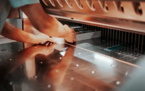
Trim lines mark where the printer will cut your banner. Place anything important too close, and you risk losing key parts of your image or message. Ignoring these guidelines almost always results in awkward, uneven borders that undermine your design.
Why Is the Safe Zone Important for Banner Design?
How to Position Text and Logos Safely
Imagine seeing your company’s logo clipped at the edge of a banner. To prevent this, keep all vital elements at least one inch inside the final trim size. This “safe zone” protects text, logos, and key graphics from accidental cropping or folding.
Consequences of Placing Important Elements Too Close to Edges
When text or graphics sit outside the safe zone, they might get cut off or appear too close to the edge, making the design feel cramped. Worse, on roll-up retractable banners, the bottom few inches often disappear into the base stand. Always check the template and leave that area clear of essential content.
What Color Settings Should You Use for Banner Printing?
Differences Between RGB and CMYK Color Modes
Digital screens use RGB color, but printers operate in CMYK. If you send an RGB file, there’s a good chance your colors will shift dramatically in print. What looked vibrant on your monitor might emerge dull or altered in the finished banner.
How to Convert Your Design to CMYK Correctly
Most design software lets you convert artwork from RGB to CMYK before exporting. Always check your files for color consistency after conversion, since some shades may need manual adjustment to match your brand’s palette.
Avoiding Color Shifts in the Final Print
To minimize surprises, proof your designs on a calibrated monitor and request printed proofs if possible. Submitting files in CMYK ensures the colors you see are the ones that appear on your banner.
What Resolution Is Ideal for Banner Artwork?
Why 150 DPI Is Recommended for Large Format Prints
For large format banners, 150 DPI (dots per inch) is considered ideal. While it’s lower than the 300 DPI standard for small prints, it produces crisp images at viewing distances of a few feet or more.
How Low Resolution Impacts Print Quality
Submit a lower-res file, and you’ll instantly notice blurry graphics, jagged text, and pixelated photos, especially when the banner stretches several feet tall.
Tips for Optimizing Image Quality Without Excessive File Size
Use high-quality images, avoid rescaling small files, and flatten your artwork layers before export. This keeps your files manageable while preserving detail.
How Should You Prepare and Submit Your Banner Files?
Preferred File Formats and Why PDF Is Best
PDFs are universally accepted and lock in your design elements, preventing unwanted font or layout changes. Always check that your PDF is set to the correct size, with bleed and trim marks included.
Converting Fonts to Outlines to Prevent Errors
Fonts can change or disappear if your printer doesn’t have the exact typeface installed. Converting all text to outlines (or curves) ensures your design prints exactly as intended.
Naming and Organizing Files for Smooth Processing
Clear, descriptive file names save everyone time. Include details like product type and size in the filename (for example: “Event_Banner_33x81_CMYK.pdf”). Keep your files organized in a dedicated folder.
What Are Specific Considerations for Roll-Up Banners?
Roll-up banners have unique quirks. The standard size is often 33 by 81 inches, but always confirm with your printer. Importantly, the bottom three inches of your design will be hidden inside the retractable stand. Keep this area free of essential graphics or text, focusing your message higher up where it will be fully visible.
Also, stable retractable stands rely on careful assembly. A well-balanced design ensures that attention stays on your message, not on a banner that leans or topples.
How Can You Troubleshoot Common Printing Issues?
When colors look different than expected, check your color mode and review your proof in CMYK. Persistent cropping or alignment problems usually point to ignored trim or safe zone guidelines. It’s always worth consulting your print provider, such as those specializing in banner printing at Doculand, before submitting final artwork, especially for large orders or time-sensitive projects. Their expertise can flag potential issues and help you avoid last-minute surprises.
A successful banner isn’t just about bold graphics; it’s about respecting the technical essentials that ensure your message is seen, sharp, and striking, exactly as you imagined.


