Have you heard the phrase “larger than life”? – this is specifically true for flex banners. Yes. flex banners are huge, eye-catching and attention grabbing. This is how they must be to catch the attention of the passers-by and make them stop and stare at it. So how do you make a flex banner grab attention instantaneously? By designing it innovatively using the right print specialist.
Let us take a look at some innovative Flex banner designs.
- Eye catching visuals, appealing message
Take a look at the flex banner designs for a talent school. The flex banners have
- Eye catching and creative visuals
- Crisp yet meaningful content
- The name of the school is bold and bright an draws instant attention.
One look at this flex design and you are bound to remember the name of the school again. These simple yet distinct designs are classic examples of how flex banners can make a huge impact with creative and purposeful visuals.
- Big and bold
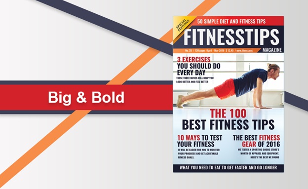
Take Hyundai i10’s flex design. This minimalistic design is big, bold and bright and can be seen even from a long distance. The impact is due to
- Big and bold lettering
- The choice of colours used
- Simple and striking design
Use this design as an example to create striking designs with maximum visibility.
- Clever layout
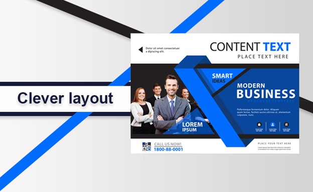
This clothing brand created an impact with its clever layout and creative use of colour and lettering. Note the use of bright yellow that draws attention to the banner even from a distance. The clever use of blue in the lettering for the word “YOU” grabs your attention instantly. This clever design makes you look keenly at the banner and scan the name of the store. Creativity is the key element in this flex banner design.
- Die cut flexes
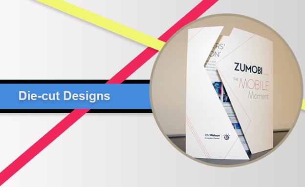
In the world of the branding on social media, die-cut flexes make an impact . Just look at this footwear company flex with its die-cut flip-flop design. The die-cut layout makes a huge impact and is instantly attention-grabbing. This uniqueness of design by the use of the die-cut layout has created maximum recall for this footwear brand and is highly appreciated.
- Let the product speak
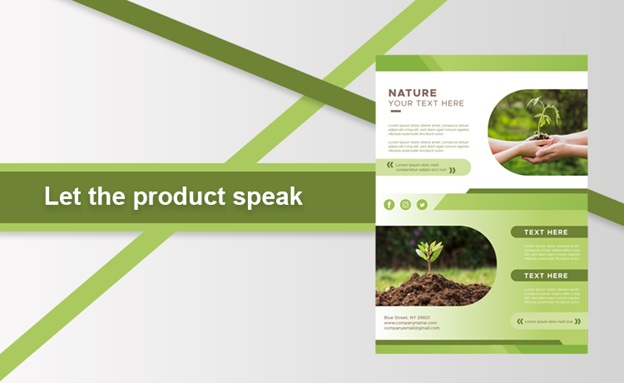
Take a look at this chocolate company’s flex design. Here they have depicted the product and its features creatively in one single image and this is enough to tell thousand stories to the onlooker. They have also used the brand colour purple to the maximum to highlight the brand. This has enhanced the appeal and made his design synonymous with the brand.
All the above flex banner designs have a lot of thought and talent invested in them and this can be provided only by the right print specialist. Follow these colour guidelines in designing flex banners to add the extra touch of creativity to them.
Colour guidelines in designing innovative flex banners
- Yellow – Yellow is a powerful colour that can be used with blue or black. It is generally used for travel or clothing industry where people take quick decisions.
- Orange – Orange represents energy and youth and is used with white, black or blue for balance. Fanta and Harley Davidson use these colours.
- Red – Red is for passion, speed and fervour. It is used along with red or white.
- Purple – Purple denotes royalty, luxury, creativity, magic, ambition and trust.
- Pink – Pink is for caring and love.
- Brown – Brown is for solidarity as it symbolizes the earthy tone.
- Green – Green is a symbol of peace and prosperity.
Create innovative flex banner designs making use of the above tips by collaborating with the right online printing services.

